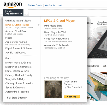
Amazon testing a new design?
…on just me? No one I've asked seems to be seeing this. I wonder how large of a group they're testing it on.
The orange and blue theme seems to have been replaced with a cleaner looking grey theme. The left category navigation bar has been replaced with a drop-down menu which expands further to the right depending on the category hovered over.
I'm attaching 3 screenshots, one of the entire new layout, a closeup of the drop-down, and a screenshot of the old layout (I don't get the new one if I open amazon in Chrome, just Firefox)


