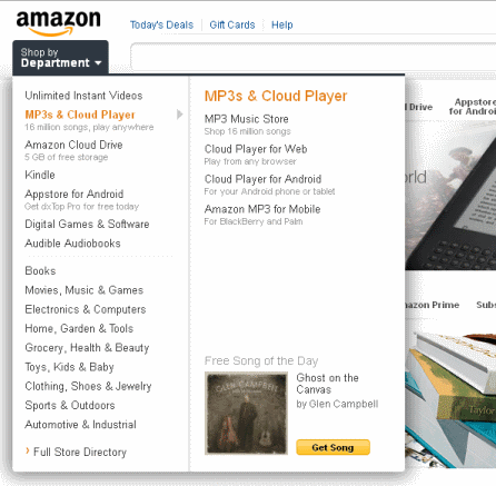
Amazon testing a new design?
…on just me? No one I've asked seems to be seeing this. I wonder how large of a group they're testing it on.
The orange and blue theme seems to have been replaced with a cleaner looking grey theme. The left category navigation bar has been replaced with a drop-down menu which expands further to the right depending on the category hovered over.
I'm attaching 3 screenshots, one of the entire new layout, a closeup of the drop-down, and a screenshot of the old layout (I don't get the new one if I open amazon in Chrome, just Firefox)
Tags: amazon, new design


spudart said,
good! new design. amazon needs it. They wield a ton of power, they need to optimize and leverage what they have more. For instance, they could be a social media giant, if they had more of a sense of community.
Seeing Amazon change their design is a step in the right direction to acknowledge they can change. I hope that change goes deeper.
August 30, 2011 @ 10:42 am
unlikelymoose said,
Did you see Target completely redesigned their site? It follows a similar approach of simplifying.
September 26, 2011 @ 8:08 am
Adam Nash Hartley said,
I still like the two designs.
February 29, 2012 @ 9:04 pm
sparx said,
Yeah.
I was really starting to get used to the "new" design, but then it went away.
I guess they were done using me as a guinea pig.
Hopefully it gets rolled out eventually (or a similar redesign).
February 29, 2012 @ 9:15 pm
David Pirce said,
I'm seeing the new Amazon layout in Chrome on Windows, but not in Chrome on Linux. Firefox and Internet Explorer on Windows show the old layout. I found this posting since I was searching around to see if anyone else is seeing the new Amazon layout.
March 27, 2012 @ 6:04 pm
sparx said,
I forget when I "lost" the new design… I think I only saw it for a few weeks, so probably in October or November.
I was kinda excited when it popped back up last week – but only in Chrome (on Win7). I just tested in Firefox and it's showing the old design.
March 27, 2012 @ 6:45 pm