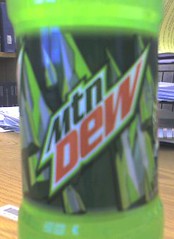
Mtn Dew?

Hey Pepsi, what gives? The Mountain Dew labeling has had some stylistic changes over the past few years, including the previous font choice (which I wasn't big on at first, but I'll admit that it grew on me) – but never has it changed its name. Mtn Dew? Mutton Dew? What is that?
"Mtn" reaks so much of an attempt by marketing to "be hip" and "in with the twitter crowd" (I imagine that's how people that have no clue speak), that it comes off as exactly the opposite. "Mtn" is the hip-equivalent of an 80-year old man trying to skateboard down a railing.. and like his actual hip, it's broken. Lame.
The pointy mountains in the design are kind of neat, but there are too many of them and they look too similar.. they look too repetitive, and uninspired. The entire re-design just looks lazy.
Why not just drop the whole "Mountain" and call it "Dew"? Or is this part of a larger plan to rename "Pepsi" to "Psi", because 3 lettered words are cool?
I guess it's time to go and get a Mutton Dew from the vending machine now. *sigh*
